Lolita Blog Carnival: 3 Prints In My Favorite Colorway
When I first read the theme for today’s Lolita Blog Carnival post, I was a little torn as to what my favorite color way is. I really like royal blue, and I really like red and I also really like red and pink. But, you know what is my absolute favorite, deep down? Red x White x Blue.
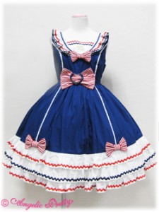 On a side note, it’s actually surprisingly hard to find accessories in red x white x blue. They are made, they just tend to sell out pretty quick, and it’s actually semi-difficult to find them second hand. Finding actual prints in red x white x blue is hard as well, because, while it is done, what you see more, are solids or people coordinating solid blue with red x white pieces. Angelic Pretty’s Frill Marine series is a great example of red x white x blue being used on a solid piece. Alice and the Pirates has been known to release things in that color set as well, as have other brands, but red x white x blue AP has a special place in my heart.
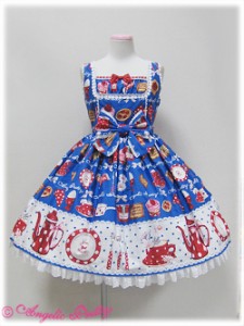
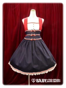
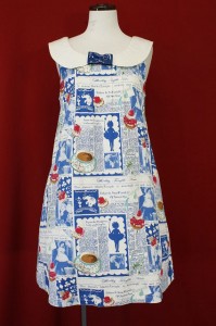
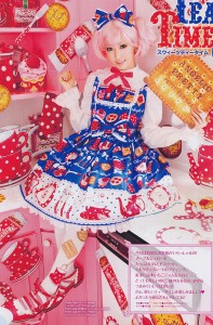 First up, we have Angelic Pretty’s French Cafe. Of the three prints I chose, this is the only one I don’t actually have in red x white x blue (or at all). I love the idea of this print, with it’s polka dot teacups (I love, love, love red polka dots!) and french kitchen ware and all the super cute desserts. I love the bright colors, I think both JSKs are cute quite cutely, and I have the sweater from this series already. However, the border print of this has always thrown me for a loop. It’s full of white! I honestly just wasn’t 100% sure how to make that work for the longest time without doing what the model here did, which is match it totally with white everything. However, it was one of my girlfriend’s dream dresses and she bought it a bit ago and wore it on ILD and she really made it look cute without using a lot of white. So now, I’m keeping an eye out; maybe she and I can both wear it sometime and be twins!
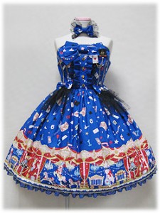
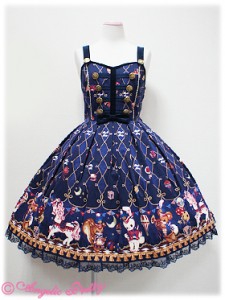
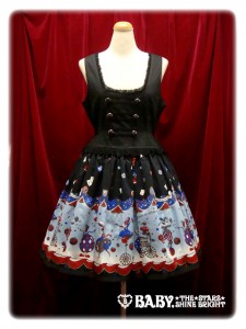
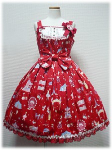
 Next comes one of my all time favorite prints; Star Night Theater also by Angelic Pretty. What can I say? I love circus prints, and I love the bare shoulder JSK cut that this came in. This is probably in the running for the most ridiculous number of things from the same series in my closet. (OP, JSK, Skirt, Headbow x 4, headband, socks, some of the plastic jewelry…) Honestly though, I love this print. It’s pretty busy and there are a lot of colors in it, but it’s primarily royal blue with big sweeps of cherry red, and gold, with black and white accents. It’s so much fun to coordinate because you can mix it with black, or white, or red or even bits of pink or gold and come out with totally different looks, and it just absolutely sings out “circus”.
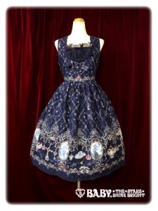
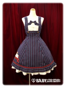
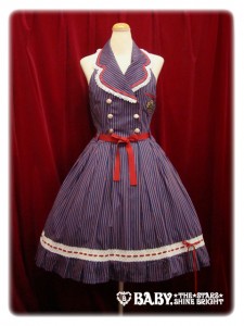
 Last, but not least, we have Angelic Pretty’s newest print, Wonder Queen. This print steers away from the super bold royal and cherry tones in the other two prints I’m featuring and more into a mature navy and wine palette. It’s still quite similar, but I think it really changes the whole feel of the print. I was honestly a little reluctant about this one. While everyone was going absolutely head over heels for it, I sorta kept feeling like the actual print was just way too busy. I think pictures like this one which included the socks (they look sort of blurry?) and used the white x red blouse added to that a little. I ended up getting the other JSK style in red and blue, and I’m planning, as of right now, to wear them with a bolero or something to minimize the heavy, busy stripes. I do have to say, the print is absolutely gorgeous up close, and I certain don’t regret getting it, it’s just that it presents it’s own challenges when it comes to coordination!
 Other blogs participating in this theme:
♥ Breiðholt ♥ Lace Teapot ♥ Vanillas Traumfabrik ♥ Lolita Glamour ♥
♥ Elegant Poupée ♥ Northern Star ♥ Whimsical Adventures of Me ♥




Hello, does the colorway refer to the dress combination colors or of the color and name of the specific dress?
People use it pretty interchangeably in the jfashion community. In general “colorway” is used in place of “color” when talking about a version of something where the “color” is two or more colors, or a gradient.
So a black dress with white trim could both be described as color:black and colorway:black x white.