Bibliotheca July/August Theme: Clutter
It’s been a bit since I’ve blogged. I have a bunch of half-written posts that I started and never finished, as per usual, but also, I just have had a lot going on in my life recently. Anyways, I thought I would jump back in with the July/August Biblotjeca theme, which is… clutter. And then I got distracted by the clutter on my blog and wrote and published a long-sitting draft for the 52 week lolita challenge. (Does it even count as a draft if it’s only the title?)
Clutter is a hard theme for me. As someone who enjoys decololi (decora x lolita), I suppose it’s not going to be surprising to most people that I am a bit of a maximist. I could show you pictures of my lolita room in disarray and the boxes of accessories I have, but I don’t think that’s really going to accomplish much. Instead, I’d like to talk about the concept of visual clutter in graphic/web design and how you can apply the same design theory concepts to lolita.
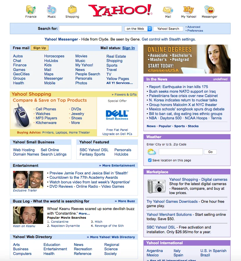
Visual clutter in graphic/web design is basically when you have so much going on that it’s hard for someone to figure out what they are supposed to focus on and/or it prevents them from finding what they are looking for.
A classic example of this, in a site that was considered to otherwise be a decently designed site at the time, is the old Yahoo portal page, which looked something like this. There are so many links on this page, they are all the same size and color, and the titles are minimal and don’t help a lot. It’s overwhelming if you don’t know where everything is already, and the search bar, which was probably what more than 50% of visitors were looking for, is pretty small. (Yahoo email being their other main product. Messenger was also pretty big, but that was an application you had installed on your computer).
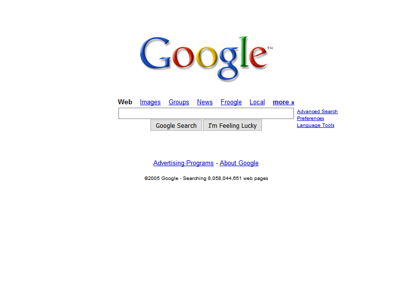
Compare that to google, who’s main selling point early on was that their homepage wasn’t a cluttered mess and didn’t have popups or other advertisements.
Visual clutter in design can also come from there being too many patterns, too many colors, no clear hierarchy for the page content, too much movement, etc.
In general though, fixing visual clutter in a design is really about giving the eye a clear path through the design, and eliminating anything extra you don’t need which is preventing that visual flow and keeping people from getting to the content they are looking for.
In lolita fashion, you can also have visual clutter, both in individual pieces and in a coord as a whole.
Let’s look at visual clutter within the design elements of a piece first. This is Baby, the Stars Shine Bright’s Voyage dans le temps ~Under the Sky of Belle Époque ~ OP. It’s worth noting that Baby is generally really good at balance, so I feel like this dress may have been an intentional choice.
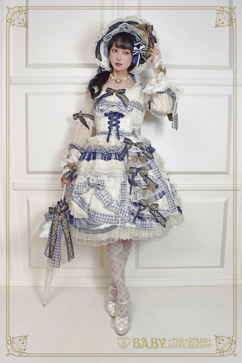
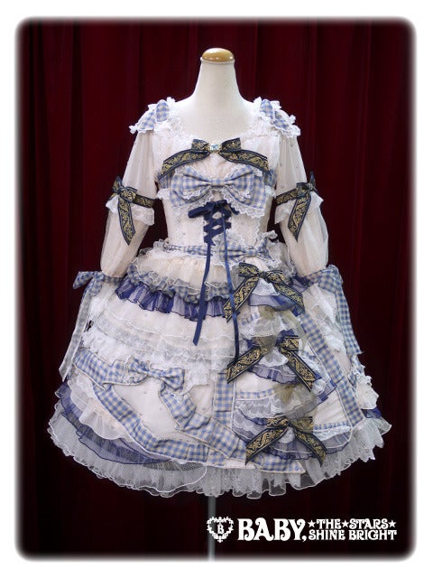
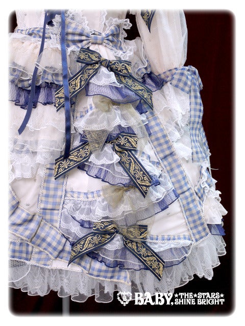
They have a few different pieces where they have done similar things with bows, but in this particular piece the high contrast draws your eyes to the corset lacing, and the darker blue bows with the gold embroidery, but they are kind of scattered around the piece in a way that there isn’t really a solid focal point there. And the lighter blue gingham ribbon is kind of going all over the place too. It intersects with it’s self and it fights with the front tiered bustle of ribbon bows.
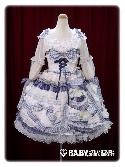
If we just take the darker ribbon out with the clone tool in our image editor very sloppily because we don’t get paid to blog and have no desire to spend hours on editing a dress we don’t like…
Already the bodice looks more cohesive. I’d move that large bow up, personally, but it now exists as a focal point. The sleeves are still weird with their multiple gathers, and they could stand to lose the mid forearm ribbons as well, but they are better. The skirt is still visual chaos.
To make the skirt visually cohesive, I think they would need to pick the tiers and the gingham bow on the left, or the tiered bustle on the right and some tiers on the left without the random gingham ribbons.
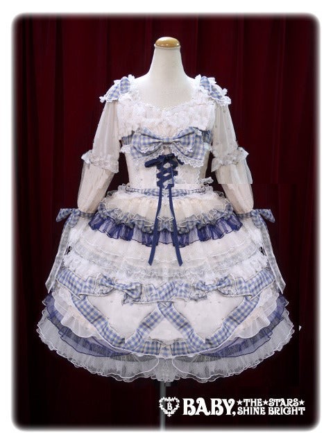
For example, if I very badly edit out the side tiered bustle part, and change that gingham ribbon a little… you get something more like this, which is still very weird, but it’s a little more visually cohesive at least.
Now, obviously, you aren’t going to edit dresses that you are buying from designers, but, this can give you and idea of why something might not feel harmonious.
Like I said before, Baby is usually pretty good at making things that are visually balanced, but many less experienced designers struggle with this. So if you are buying from a new indie brand, or a very inexpensive brand which may not have a lolita on their design team, it’s worth taking a moment to identify if the piece has a clear focal point and visual hierarchy before you buy.
Of course visual clutter isn’t always design elements, sometimes it’s the prints on print pieces.
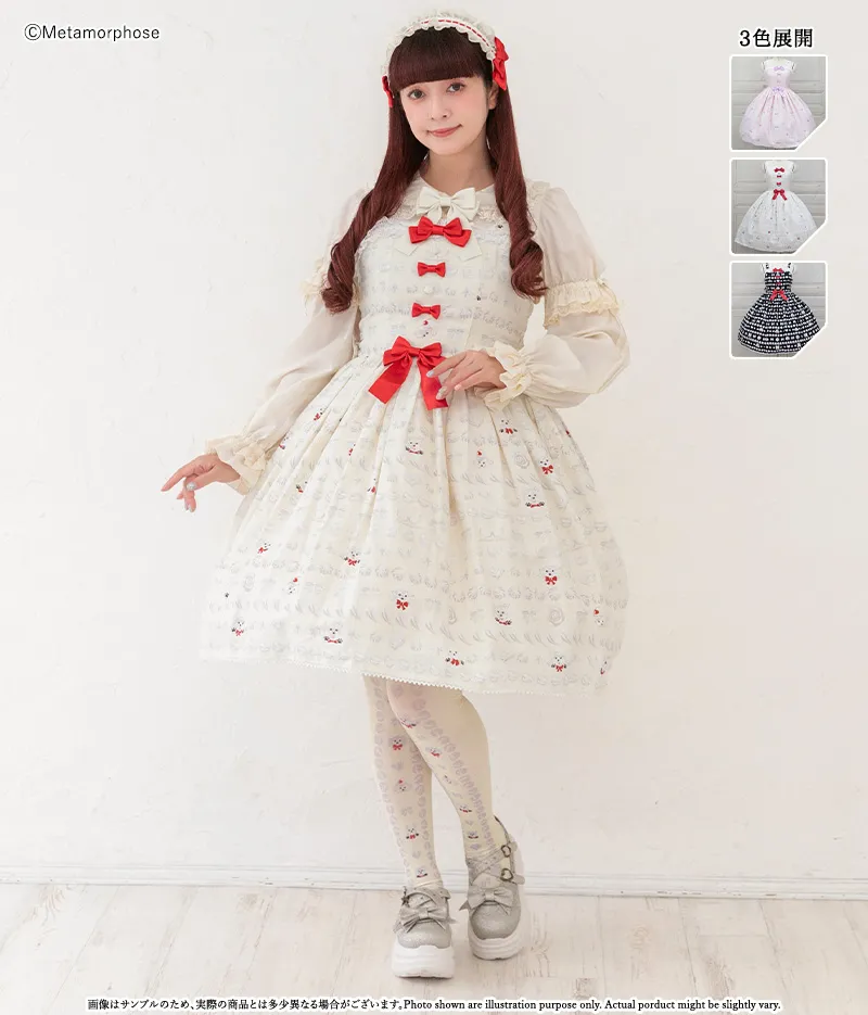
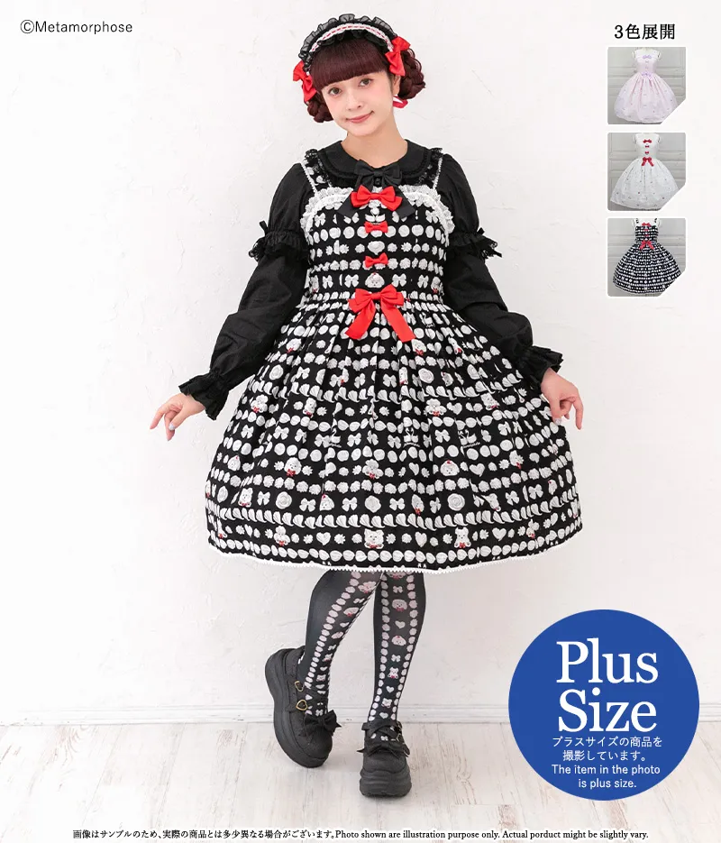
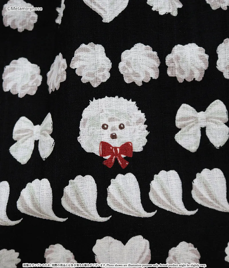
This meta print works well in the lighter colorways, but in the darker colorway, the small, low-contrast print gets lost and becomes visually overwhelming.
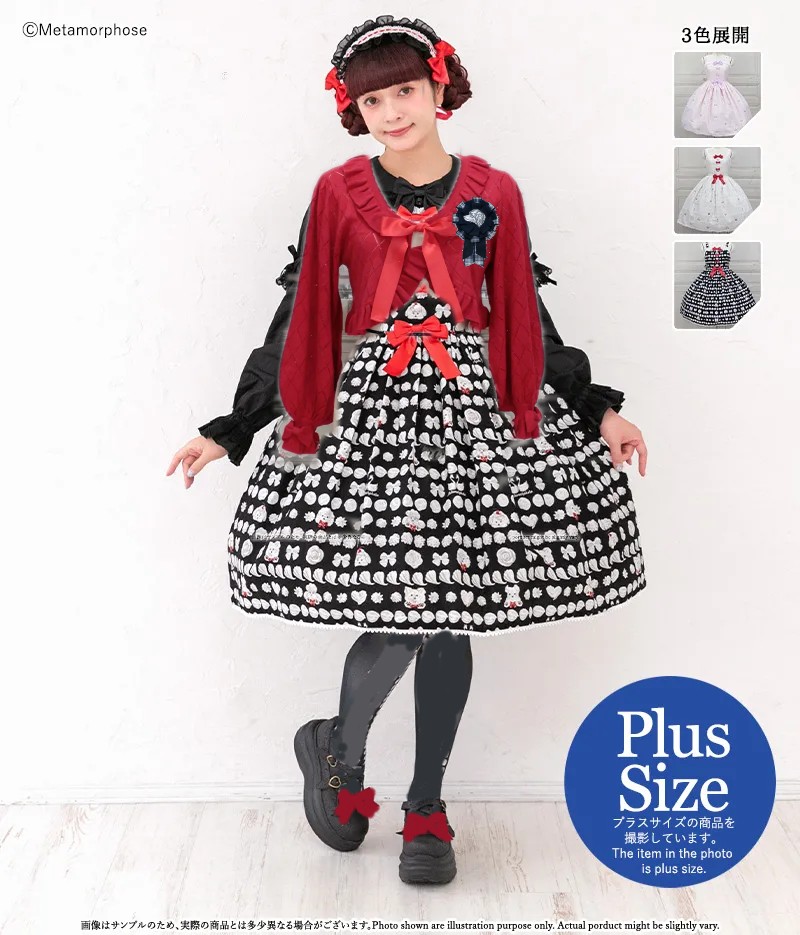
You can mitigate something like this by coordinating it with bold, solid colors, and by using over-layers like a bolero to minimize how much of the print is visible, For example, I’ve badly edited in a red bolero here and then for a focal point, I’ve added a dog rosette from MossBadger.
A black or white bolero would also work, as would a jacket, coat or cardigan. Sometimes you can also use an apron or an overskirt, though I’m not sure either of those would work with this particular design.
I still don’t love this, and I do kind of wish that they had done this as a chocolate colorway instead with a brown poodle on a darker brown base and chocolate frosting, but I do see the appeal of black x white x red french poodle.
It’s worth noting that the same rules about balance and focal points apply, no matter how detailed or simple the coord is. For example, here are some very visually busy coords I wore to Katsucon last year. While there is a lot going on, I’ve kept the proportional color balance from the dress in the head accessories. So with star Night Theater, it’s a blue base with red accents, and then pops of white, gold and black. The bag and blouse and leg wear have a black base to make the blue and red pop more, and there are focal points in the hair accessories (the card), the dress (the red waist bow) and the coord as a whole (the bunny bag). In the red coordinate, the hair accessories carry over the red base and the pink accents, while the neck accessories, wrist accessories and hip bows counter balance the busy pattern of the hair accessories and move that visual busyness through the coord.


When doing something visually busy like this, my primary way of ensuring balance is to pick a large item in the main color and pair it with a smaller item in an accent color, usually on a diagonal offset. So as I’m placing bows and accessories on my head for example, I’m adding a smaller item in a different color with each larger item to deliberately move the color through the coord.
As long as you give it balance and give the eye a visual path through the coord, it will work.
A chocolate poodle would have looked so much better! I guess they were also having a node to polkadots, but this is not balanced as polkadots.
Very good points, and I enjoyed the edits of that Baby dress…what can I say, fun visuals are fun ^__^